
Developed way back in the 18th century by a wealthy Japanese businessman and rice trader, Munehisa Honma, candlestick charts have become a staple in modern technical analysis. These charts are popular in multiple markets, including stocks, Forex, and commodities.
If you’re curious about the market it originated from, it’s actually rice. Honma used enhanced knowledge of the rice markets to develop a diligent and accurate trading system. The system was so successful that Honma achieved the rank of honorary Samurai and became a financial advisor for the government.
Candlestick charts act as a visual representation of an asset’s price movements and display multiple bits of price information. Read on to learn how to read candlestick charts, interpret all these bits of data, and use them to make informed trading decisions.
Start from $10, earn to $1000
Candlestick vs. bar charts
Candlesticks and bar charts are similar, to the point that some may not even notice the difference between the two. Both have bodies in which they store the information, making them great studies for those who plan to make a big trade. Both charts show the high, low, open, and close prices for the day.

When you consider the opening price for a specific timeframe, the bar chart will care more about the closing price of the previous period. However, candlesticks will put their focus on the opening price in the current period. This is where the similarities come in, because most of the time, the prices are nearly the same.
The majority of forex traders use candlestick charts instead of bar charts. There is no rule to that, and whoever wants to use bar charts may easily do that. With that in mind, candlestick charts are the preferred option, since many patterns were built on them.
Bar charts can also occasionally offer more precision, especially when you are drawing a trendline on the chart. This is because bar charts are mainly just lines. On the other hand, candlesticks have bodies that take up more space, potentially reducing precision.
Still, candlestick charts are more popular because they use color. This makes it easier for them to tell if they are dealing with a bullish or bearish price direction.
Effective strategies in your mailbox
Subscribe and discover a fund of trading knowledge
Great! Please check your email
We’ve sent you an email to confirm your subscription
Something went wrong
Try reloading the page. If that doesn’t help, please try again later
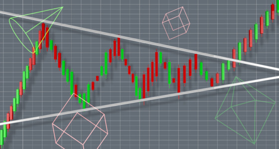
How to analyze candlestick charts
The body of the candle will suggest the opening and closing of the price during a specific timeframe. Knowing this is important, as you can make the correct trading decision. The color will also tell you whether a price is increasing or decreasing.
If you notice that a candlestick chart for one day of the month has more reds in a row, then you are dealing with a falling trend. On the other hand, green candles suggest that you have a rising trend on your hands.
Looking above your candlestick’s body, you will notice some vertical lines referred to as wicks. This will tell you the highs and lows of a traded price. If you have a red candle with a short upper wick, then it means that particular stock opened around the day high. On the other hand, if the candle is green and the upper wick is short, then it closed near the day high.
Knowing this can help you calculate the most profitable moment to make a trade.
Components of a candlestick

The wide part of a candlestick is called the real body. It represents the difference between the opening and closing price for the period (regarding the timeframe) – if it isn’t filled in, it means the asset closed at a higher price than it opened (bullish movements). If the body is filled, the price closed lower (bearish). This difference is indicated by color. Most traders set the parameters so that a green or white candle represents a bullish move, and a red or black candle – bearish.
Earn profit in 1 minute
The wicks, tails, or shadows (used interchangeably) are long thin lines above (upper shadow) and below (lower shadow) the candle’s body. These represent highs and lows for the given period. The highest point of the upper shadow demonstrates the highest traded price, while the lowest point of the lower shadow – the lowest traded price for a certain period. If there are no shadows, it means the asset didn’t trade beyond the opening and closing prices.
When you learn how to read candlesticks, you’ll retrieve the following information:
- Open price
- High price
- Low price
- Close price
- Direction
- Price range
5 best coffee types for traders
Coffee is a great beverage for traders. A few daily cups of coffee improves the mind and enables you to make better trading decisions. Check it out!
Read more

Types of candlesticks

A regular doji looks like a cross and represents a perfect balance of supply and demand, a situation in which neither bulls nor bears are winning. It has two wicks of the same length but no real body. A long-legged doji also represents a market equilibrium and uncertainty, but in this case, the wicks are longer, showing that there are equal amounts of confident bulls and bears.
A dragonfly doji also doesn’t have a real body. What’s more, it doesn’t have an upper wick (or it’s very small); it only has a long shadow at the bottom, so it looks like a T. This means prices opened high, sold off, and returned to the opening price; it often denotes a bullish sentiment.
A gravestone doji looks like an inverted T because it only has the upper shadow. This type of candlestick often denotes a bearish sentiment.
In a hammer, the lower shadow is at least twice the size of the candle’s body. It is formed when the asset trades at a much lower level than it opened but then rallies back up to close near the opening price. A hammer often appears after a prolonged downtrend and can indicate a potential upside reversal. An inverted hammer is the opposite – a relatively long upper shadow occurs mainly at the bottom of downtrends and can be a sign of a potential bullish reversal.
A hanging man is similar to a hammer but suggests a bearish reversal. A shooting star looks like an inverted hammer but is a bearish reversal candlestick.
A marubozu candlestick lacks both upper and lower shadows. It indicates that the trading range was wide, but there was a strong conviction by buyers or sellers (it depends on whether it closed up or down). It shows that the asset traded in one direction within the session and closed at its highest or lowest point.
How to spot patterns on a candlestick chart

There are three types of candlestick patterns categorized by the number of candles in a formation.
1. Single candle pattern
The patterns are formed with just one candlestick. The more famous patterns are:
- Doji
- Hammer and inverted hammer
- Bullish/Bearish marubozu
2. Double candle pattern
Double candle patterns are formed by two candlesticks:
- Bullish engulfing: When a smaller bearish candlestick is followed by a bigger bullish candlestick, the body of which fully overlaps the bearish one, it signals a reversal of a downtrend.
- Bearish engulfing: A smaller bullish candlestick is overlapped by a bigger bearish candlestick, which signals a reversal of an uptrend.
- Bullish harami: A potential reversal in a downtrend is signaled by a small increase in price (bullish candle) after a subsequent drop (bearish candle).
- Bearish harami: A potential reversal in an uptrend is signaled by the opposite setup from the bullish harami.
3. Triple candle pattern
Finally, triple candle patterns are formed by three candles. A few examples:
- Morning star: It’s a bullish trend reversal pattern made up of a long bearish candlestick, a bearish or bullish candlestick with a short body and long wicks (indecision of the market), and a long bullish candlestick.
- Evening star – This bearish trend reversal pattern consists of a long bullish candlestick, a short bearish or bullish candlestick, and a long bearish candlestick.
- 3 white soldiers: It’s a bullish pattern made up of three consecutive long-bodied candlesticks, and it occurs at the bottom of a downtrend.
- 3 black crows – This one is formed by three consecutive bearish candles at the end of a bullish trend. It describes a potential market downturn.
Takeaway
Of course, this is just an introduction to candlestick charts and patterns. But these basics are essential to deepen and broaden your expertise in technical analysis. Don’t hesitate to refer back to this article whenever you need to refresh your knowledge of the basics!
Trading with up to 90% profit
+2 <span>Like</span>