Despite the effectiveness of trading charts, such a fundamental economic newspaper as the New York Times (founded in 1851) didn’t start publishing price charts until 1930. Today, the newspaper includes at least twenty charts in each edition.
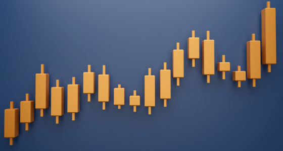
A candlestick chart is the most popular type, and it’s used by newbies and professionals alike — especially for short-term trades. It allows the user to apply various technical tools and look for patterns that predict price movements accurately. However, minor price changes aren’t the only trading opportunity, especially in periods of uncertainty. If you plan to do longer-term trading within the major trend, you should consider using a Renko chart.
Start from $10, earn to $1000
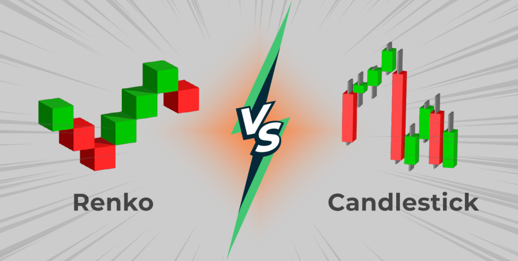
Renko charts vs. candlesticks: fundamentals

Candlesticks are used in a price chart that reflects investors’ emotions by showing the size and direction of the price for a certain period (timeframe). Traders use it to make decisions on entry and exit points based on patterns and technical indicators. The candlesticks have different sizes, as they are formed whenever the timeframe’s period ends, regardless of the price movement. For instance, on a daily chart, each candle will stand for one day. On the 5-minute chart, a candle will be formed every five minutes.
Renko is a price chart built using price movement and excluding a time interval. It’s the key difference if you compare the Renko chart vs. candlestick and other charts.
The indicator consists of bricks formed at 45-degree angles to one another. The frequency of a brick formation depends on the box size, which reflects the magnitude of price movement. For example, if you want to see when the price moves ten pips (either up or down), you set this number for the box size.
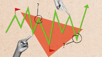
If you look for similarities between Renko bricks and candlesticks, you can have a look at their appearance. Usually, Renko bricks and candlesticks have green color for the price rises and red color for the falls. This makes it easy to understand where the market goes.
Candlesticks provide comprehensive information, as every candle reflects an asset’s highest and lowest rates for a specific period represented by shadows. Although the standard Renko chart doesn’t have shadows, some trading platforms provide the variation when the bricks have wicks.
Effective strategies in your mailbox
Subscribe and discover a fund of trading knowledge
Great! Please check your email
We’ve sent you an email to confirm your subscription
Something went wrong
Try reloading the page. If that doesn’t help, please try again later
Renko charts vs. candlesticks and indicators
While you can implement numerous indicators on the candlestick chart, it’s not the case for the Renko type. There are a few indicators that can be applied to price bricks.
First, as Renko is based only on the price rather than on the time interval, indicators based on time won’t work on this chart for sure. You should exclude all volume indicators, as they won’t provide any signal.
Second, most indicators are applied to determine the perfect time to open and close a trade. The Renko chart isn’t used for defining entry and exit points. Therefore, the usage of most indicators doesn’t make sense.
Third, you should get more confirmations by backtesting an indicator on Renko. The percentage of correct signals is expected to be lower than on the candlestick chart.
Trader’s level test
Answer 7 short questions and define your level as a trader. Take the test now to evaluate your real knowledge!
Start test

Does a Renko chart work?
Are Renko charts useful? It’s a common question, as it seems the bricks don’t provide much information on price, trend, and market sentiment, unlike candlesticks. But that isn’t the case.
The global financial markets are always affected by macroeconomic and political events. For example, at the end of 2018, the stock market indices were plunging due to the risks of the US-China trade war, the US recession, a weakening growth of the global economy, and an inverting yield curve in US Treasury bonds. At the beginning of 2019, the situation started improving.
The gold market was the best option to invest and trade, as gold is a safe-haven asset that appreciates in periods of global uncertainty. The gold market provided clearer trends that traders could rely on, especially in periods of constantly changing market sentiment.

Gold provided numerous opportunities. The price moved in one direction within the medium term, allowing traders to open positions within reliable trends. However, the trend’s length and solidity still didn’t allow traders to predict price reversals due to enormous global turbulence.

If you look at the Renko chart, you will see that there were several bricks during the period depicted on the chart above. This means that it was easier to open a trade on the Renko chart defining a brick size ahead than looking for trend reversals on the candlestick chart.
The Renko chart seems to be more effective in periods of global uncertainties.
Final thoughts
Renko and candlestick charts are absolutely different. Although candlesticks provide more information on the price direction, Renko bricks can also be useful for making trading decisions. The Renko chart filters out small price movements so that traders focus on the overall trend only. However, some useful data for making a decision is lost. Therefore, if you want to trade in the long-term trend in periods of increased volatility, you should apply the Renko chart. If you aim to trade on minor price changes, you better use the candlestick chart.
Earn profit in 1 minute
<span>Like</span>